Design Dissection: Foetus, Limb
Published on July 30th, 2009 in: Art, Current Faves, Issues |By Ann Clarke
For a discussion of the music on Limb, please read Less Lee’ Moore’s review here.
For a discussion of the Foetus NYC documentary, please read Less Lee Moore’s review here.
Since I have reviewed the musical works of JG Thirlwell on more than one occasion (as well as interviewed the man himself), I am officially burned out from the praise that I’ve given his musical merits. Sorry JGT, I can’t think of any more ways to say that your music “kicks ass!” That only really points to an audio preference and not much more. . . and I can only expound upon those ideas so much!
However, there is one area that I do have some expertise in, and that’s Graphic Design, specifically, product packaging and production. I have two professional Graphic Design degrees—plus a work history solely in that field—and as far as the design and production part of it, well. . . that’s how I keep a roof over my head, and my refrigerator full. So with that said, here are my insights, more or less a companion piece to Less Lee’s musical observations.
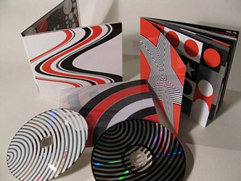
Photo from Foetus.org
First off, I would like to say… if you are planning to download Limb. . . Fuck You! For fuck’s sake. . . buy the goddamned thing! Listening to the mp3s is fine and dandy if you actually own the CD and you’ve added the tracks to your favorite mp3 player or whatever. Yes, the music itself is fabulous, but if you skimp on the actual tangible object, you are truly missing out! In addition to not getting the Foetus: NYC DVD, you are also forgoing the pleasure of getting limited edition prints of some really stellar fine art!
Secondly, from a technical standpoint, this is something worth delving into! Thirlwell actually designed the visual accompaniment himself, with some technical help from Heung-Heung Chin (who is a well established Graphic Designer in her own right). As a combined effort, the results are particularly stunning, and from a production standpoint, probably a very expensive project to finance! If they stuck to CMYK it may have been slightly more cost effective, but if that vibrant red is a spot color, I know that was definitely an up-charge. The paper stock has an aqueous glossy coat, and the latest printing technologies out there are equipped to handle it at a decent rate, but when you get into the area of spot-varnishes or special paper stock that is textured, that’s when the costs add up.
The inner packaging has neither of the above (which it doesn’t need; it’s effective as is), but what it does have is volume. The booklet is 48 pages long (on double sided paper stock) and each page has its own identity. It’s like having a hand-held gallery! Also, the packaging itself has a protective outer sleeve that has even more artwork! By inspecting this sleeve, it seems to have been accomplished by an industry method known as Pressure Sensitivity, which is basically higher quality UV flexo/screen combination printing and is conformable to whatever surface needed, with seamless transparency. In this case, it was a heavier plastic material… and this process does not come cheap!
Finally, from an aesthetic perspective, this is pleasing to the eye! This isn’t some slapped together shit that was put together by an intern at Sony who doesn’t care about how it looks because they’re too busy doing the work of a paid employee (and not getting the credit). There are some clear-cut visual homages to artistic movements for which JGT has a fondness, ranging from Op-Art, Pop Art, Minimalism, Futurism, De Stijl, Russian Constructivism, Subtraction, Pop Culture Iconography, and Hieroglyphics. This collection of visual influences were all executed using JGT’s familiar color palette of red, black, white, and grey. . . which brings this package into the already established Corporate Continuity of prior JGT works.
The only criticism I will offer (from a typographical stance) is that the very informative red text—in a four-page spread towards the end of the inner booklet— does not read well over the grey color fields. It’s hard to read, but it’s also hard to print! From a technical standpoint, it does not “trap” well, nor does it have good contrast. The text is very small, but decently laid out in a nice sans-serif typeface (it looks like Futura to me), but could benefit from some fine-tuning with the kerning and tracking. In the future, JGT should consider not using red text on grey, because it’s ineffective. However, the rest of the package as a whole is extremely well done, and if the music itself doesn’t motivate you to buy this, hopefully my endorsement of the art will.
Foetus, Limb is only available via the Foetus.org Shop.
RELATED LINKS:
The Venture Bros., The Music Of JG Thirlwell, Popshifter May/June 2009 issue
JG Thirlwell’s Best Of 2008 List, Popshifter January/February 2009 issue
Crushing The Mold: An Interview With JG Thirlwell, Popshifter March/April 2008 issue
One Response to “Design Dissection: Foetus, Limb”
August 1st, 2009 at 2:07 pm
This is a cool article as well — I’d love to see a full dissection of JGT’s entire ouevre. (Uh, if Less Lee doesn’t want to run such a thing, Kittysneezes would… but then again, Less Lee’s not INSANE, so I assume she’d be all over that…8) Really — ANY Foetus album pretty much falls into the category of “Fuck you if you download: BUY for the art”. Dude’s a genius.
Time limit is exhausted. Please reload the CAPTCHA.