Today In Pop Culture: America Meets Modern Art And Hates It
Published on February 17th, 2016 in: Art, Culture Shock, Museum Exhibitions, Today In Pop Culture |Art has never been easy to define. America spent a lot of time viewing art under the Classical model. Everything looks as it should. Humans look like humans, dogs look like dogs. It’s an almost prim way of looking at art. It has its place. It’s rational, realistic and relatively normal. Everything is what you expect it to be.
On this date in 1913, all that changed.
Best Art Prints Of 2014: Kevin Burke, Filmmaker
Published on December 19th, 2014 in: Art, Best Of Lists, Horror, Movies, Science Fiction, TV |I’ve had a great year as an art fan. It was really difficult to come up with a short list of my favorite releases, especially given that my own personal collection grew by almost 50 prints this year, but I’ve divided a list into two categories of some of my personal favorites of this year, in no particular order.
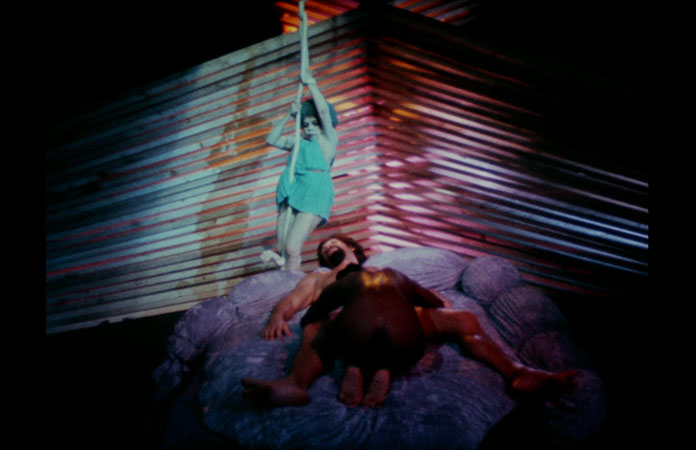
DVD Review: Wakefield Poole’s Bible!
Published on February 7th, 2014 in: Art, Culture Shock, Current Faves, DVD, DVD/Blu-Ray Reviews, Movie Reviews, Movies, Retrovirus, Reviews, Teh Sex |When we see the rating X or XXX, what is the first thing that comes to mind? Hardcore porn? Or a film that has so much sexual content that it isn’t fit for an R rating? Sometimes neither of these things can be the case. Back in the 1960s and ’70s films that had sexual content were rated X because in that day and age it was considered too much. Those films are nothing compared to what we have today between porn and R-rated films that are deemed “extreme.”
Vinegar Syndrome is probably a name that you aren’t familiar with yet, but take note because these guys are true fans of vintage/art cinema. I was fortunate enough to watch one of their reissues, an X-rated film from 1974 called Bible! directed by Wakefield Poole. Just looking at the synopsis or reading about it you might think it’s a hardcore porno or maybe a sexplotation film. I’m here to tell you that it’s neither.
Best Alternative Posters Of 2013: Tal Zimerman
Published on January 10th, 2014 in: Art, Best Of Lists, Horror, Movies, Science Fiction |Godzilla by Phantom City Creative
Another award-winning design for Phantom City Creative—Godzilla AS the wreckage he causes.
The balance of simplicity, power, and conceptual playfulness that marks the modern movie poster movement just does not get better than this.
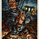
Evil Dead 2 by Jason Edmiston
Edmiston’s Evil Dead 2 poster got a ton of notice due to, among other things, the unprecedented smoothness between blended colors. Jason once again raises the bar for the screen print set.
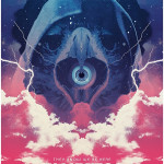
The Visitor by Seek and Speak
This is the kind of poster you hope the movie is half as good as. It looks like how my uncle’s room smelled in the ’70s. It looks like all the Uriah Heep songs. It looks like that He–Man episode where everyone takes acid. Or did I watch it on acid and it just looked that way? I dunno.
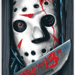
Friday the 13th: The Final Chapter by Gary Pullin
Ghoulish Gary Pullin’s poster for Friday the 13th: The Final Chapter is a master class in unsubtle. Sometimes the indie poster scene gets a little too clever. Other times, it’s just a giant fucking Jason face coming through your wall. And I like that.
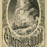
There Will Be Blood by Aaron Horkey
Impossibly tight technique meets million dollar concept in Horkey’s There Will Be Blood print for Mondo. Horkey basically prints money, anyway. Ask anyone who has tried to buy one of his posters.
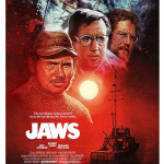
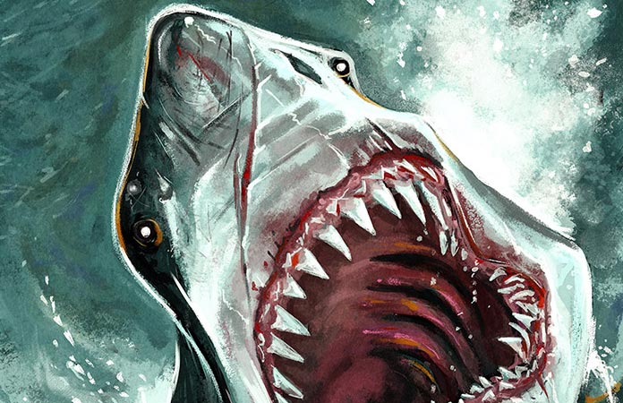
Jaws by Paul Shipper
This piece was from a Jaws tribute show, and if you told me it was a long lost Drew Struzan design, I would have believed you. Thank goodness for designer Paul Shipper and his unwillingness to let the classic ’70s and ’80s poster style die.
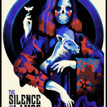
The Silence of the Lambs by We Buy Your Kids
Looking like a playing card from Satan’s personal deck, WBYK’s The Silence of the Lambs print combines concepts and aesthetics to form something both beautiful and creepy. A modern classic.
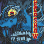
Creepshow by Mike Sutfin
Sutfin’s pays tribute to the original poster designs for BOTH Creepshow films (there is a third film, but we don’t talk about it . . . ever) and the variant edition glows in the dark. A movie that’s fun and spooky needs a poster big on both.
Frankenstein by Tom Whalen
This Frankenstein poster is but one of many designs found within Tom Whalen’s Universal Monsters folio for boutique gallery Dark Hall Mansion. I picked this piece because, well . . . that’s how I was feeling at the time. Tomorrow, it may be the Dracula poster, or the diptych with ALL the monsters in it. Who knows?
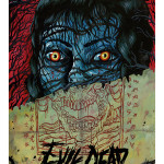
Evil Dead by Trevor Henderson
This was one of the first posters I thought of when I signed up to make my list. Those eyes! They don’t let you forget them so easily. This image was used to promote the film’s SXSW premiere.
Tal Zimerman is a founding member of the comedy troupe The Sketchersons, writer for Rue Morgue magazine, game show winner, and currently the subject of the upcoming documentary feature WHY HORROR?
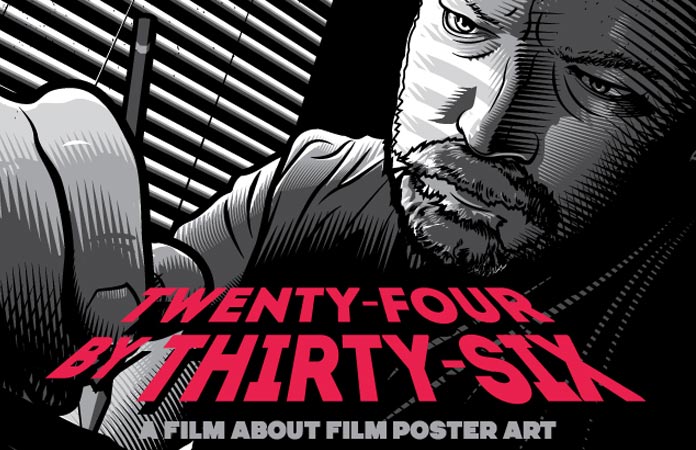
“Twenty-Four By Thirty Six”: A Documentary On Movie Poster Art Needs Your Help
Published on November 29th, 2013 in: Art, Kickstarter Campaign, Movies, Underground/Cult |If you’re a member of the movie superfan community, you know that it’s not just the movies we love to obsess over, it’s everything associated with those movies, from quotes, to the name of the set designer, to the poster art. You’ve memorized the poster art (and variants) of your favorite movies. You know all too well that the Mondo limited edition screen prints of movie posters sell out almost immediately and that those lucky enough to acquire them often sell them for hugely inflated prices online. And you definitely know the names of the artists who’ve created these posters.
Now there’s a documentary called “Twenty-Four by Thirty-Six” that “explores the world of movie poster art, past and present; the artists who create it, companies that commission it, galleries that display it, and collectors and fans who hang it.” But in order for this doc to come to fruition, they need our help and they’ve launched a Kickstarter to do so.
“Twenty-Four by Thirty-Six” not only follows a couple of fantastic illustrators, but also profiles some well-known artists and personalities in the screenprinted poster community (like Tony Seininger, Gary Pullin, Jason Edmiston, Phantom City Creative, Kevin Tong, Tim Doyle, N.E., Paul Ainsworth, and many more), and talks to fans and collectors.
Besides knowing that you helped contribute to the completion of this documentary, what’s in it for you? There are lots of rewards, from having your name listed in the credits, to a digital download, T-shirts, DVDs, Blu-Rays, various versions of the film poster (including a glow-in-the-dark version), a signed John Alvin Alien poster, a private screening of the film at a BBQ with the director, and lots more.
The Kickstarter ends on December 21 and right now they haven’t reached their goal of $25,000. So check out “Twenty-Four by Thirty-Six” on Kickstarter and get to donating!
Movie Review: Hellaware
Published on October 16th, 2013 in: Art, Comedy, Current Faves, Movie Reviews, Movies, Reviews |One of the greatest things about Kids in the Hall was the show’s ability to convert the utterly banal into comedy. It requires far more skill to underplay a scene and still get laughs, as the audience imagines a waggling finger pointing at the object of the joke. Hellaware, from writer/director Michael M. Bilandic, achieves this so well it leaves the viewer breathless, both from amusement and admiration. At 75 minutes, Hellaware is expertly paced, wringing the most out of every detail in every scene and each seemingly throwaway secondary character.
Assemblog: September 20, 2013
Published on September 20th, 2013 in: Art, Assemblog, Movies, Trailers, TV |New this week on Popshifter: Tim says goodbye to D.O.A. and hello to the new Robocop trailer; Jemiah calls Kenny Feinstein’s Loveless: Hurts To Love a masterpiece; Melissa has mixed feelings about Ha Ha Tonka’s Lessons; Jeff approaches bridges and A chords in a new installment of Waxing Nostalgic; and I find The Exquisite Corpse Game remarkable.
FanExpo Canada 2013: 100,000 Fans Can’t Be Wrong
Published on August 29th, 2013 in: Art, Canadian Content, Cartoons, Comics, Concert Reviews, Conventions/Expos, Gaming, Horror, Movies, Music, Science Fiction, Toys and Collectibles, TV, Underground/Cult |Another year of FanExpo Canada has come and gone. As usual, the four-day event was jam-packed with people and panels, photo ops and paraphernalia. With so many things happening and so many attendees, there are bound to be a multiplicity of experiences. Here are mine.
Day One: Thursday, August 22
The doors opened at 2:00 p.m. and as usual, there was already a line-up. I don’t like to brag, but I enjoy being able to go through the Media entrance and not wait in the lines outside. Although, never fear, non-media folks: I still have to wait in a line to get onto the exhibition floor like the rest of you. (I do think it would be nice if media got to go in about an hour before the show opens, just to prepare for photos and video shoots.)
This year, due to the addition of the Sports segment and the expected increase in attendance, FanExpo took up multiple floors in both the South and North buildings. This meant a bit more walking across the bridge between buildings, but it also made for less cramped conditions (at least on Thursday, Friday, and Sunday; I didn’t attend Saturday).
FanExpo Canada 2013: Top Ten Picks
Published on August 21st, 2013 in: Art, Canadian Content, Cartoons, Conventions/Expos, Feminism, Gaming, Listicles, Movies, Music, Upcoming Events |
The Cybertronic Spree
Photo © Paul Hillier Photography
FanExpo Canada 2013 runs from Thursday, August 22 through Sunday, August 25 this year. The annual four-day event is crammed with stuff to do and see across multiple fandoms, like anime, comics, gaming, horror, science fiction, and now, sports. It can be a little overwhelming to plan out your days.
My favorite part of FanExpo is always Rue Morgue’s Festival of Fear, but with so much to choose from, there’s always a bit of crossover. I’ve come up with my Top Ten Picks of this year’s FanExpo, which I think will satisfy all of your fandom-related urges.
Forget About Shark Week: It’s Shark Month with the August Kickstarter for Frenzy, An Illustrated Prose Novel
Published on August 8th, 2013 in: Art, Books, Comics, Horror, Kickstarter Campaign |If you prefer your sharks to be more like Jaws than Sharknado, here’s something you can really sink your multiple rows of teeth into: Frenzy, where the sharks are the stars, and the humans are the threat!
