A Woofer In Tweeter’s Clothing: Mismatched Album Art
Published on July 30th, 2009 in: Art, Best Of Lists, Issues, Music |What is an album with artwork so ugly or hideous that, despite having a good feeling that you’d like the music on there, you could never bring yourself to own?
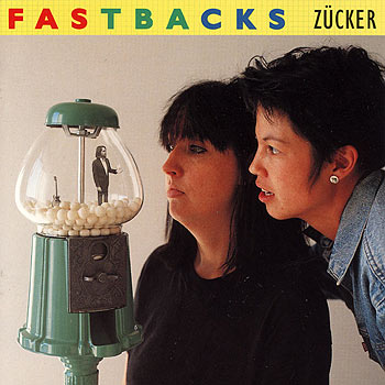
The Fastbacks, Zucker
Paul Shirley, Oakland
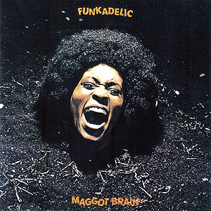
For years I avoided Funkadelic’s Maggot Brain for this very reason, much to my own peril.
Arratik, Asheville NC
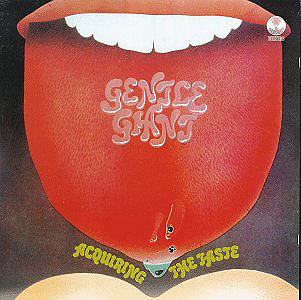
Never had that exact problem, but Gentle Giant’s Acquiring the Taste was a bit off-putting at the time. I did pass up buying that because I hadn’t heard the music yet. That was my first experience where I was aware that cover art influenced a purchase decision. When I was a kid living at home, I had to be very careful of my dad with cover art. I bought a Genesis LP that had a small B&W picture of the guys (I think it was in the LINER NOTES, for fuck’s sake) and one of them was wearing a huge feather boa, and camping it up real good. Fabulous! That hit the dustbin as soon as I turned my back on him. A brand-new album. Damn bastard. Whenever I was out of the house, he always tossed anything that he didn’t like or want to have around.(Including me.) Someone gave me an old Muntz TV that WORKED. Two days later: gone. What a prick. I still have serious boundary issues. (Sorry, I needed to get that out.)
Andrew, Columbus OH
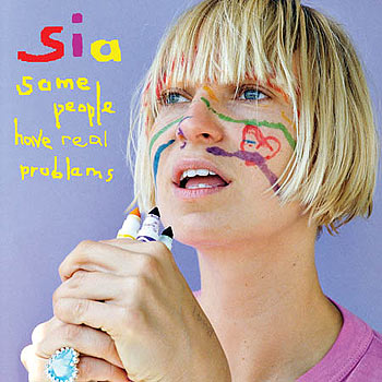
In terms of hideousness, the answer would have to be Sia’s Some People Have Real Problems. The cover sleeve depicts the cute, childlike chanteuse with the Dutch-boy bob) that looks as though she cut it herself) gazing into the distance, holding a clump of Crayola markers in her hands. She’s drawn some icky-poo precious hieroglyphs on her face, neck, and hands. I first saw this while waiting in line at Bucky’s, and the picture was enough to make me lose my appetite. A few months later, learned that she wrote and performed the song that played over the closing scene in the final episode of Six Feet Under (which I’d heard without the benefit of the visuals) and the song was enough to break my heart. However, there was no earthly way I could spend my hard-earned dollars on something with that monstrosity on the sleeve.
Chelsea Spear, Popshifter
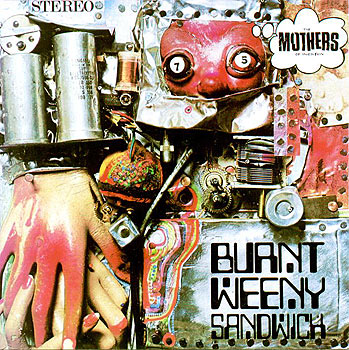
The art that really creeps me out is Burnt Weeny Sandwich by The Mothers of Invention. The music is just fantastic, but the album is just. . . OOOOOOOHHHH! Creepy!!
John Keeley, Seattle WA
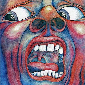
At first I didn’t buy King Crimson’s In The Court Of The Crimson King album because of its downright freaky cover (look at those nostrils!), but after hearing “21st Century Schizoid Man” I had to buy it. Now whenever someone sees it they say, “What the hell is that? It’s hideous.” I respond with a feeble, “Uh. . . it’s King Crimson. . . you know, Robert Fripp’s band?” To which they reply with a “What sort of name is Fripp anyways?” “Well it’s Robert Fripp’s name.” And thusly, the conversation is steered away from the freaky cover.
Mark Coutts, BC Canada
I first came across Sweet Sixteen by Royal Trux while going through my college station’s music library, weeding out the records that we would play that year and which we’d give away. We were also getting rid of records before a certain date, and with those, we were given the option of getting rid of them or keeping them for ourselves. This one was right on the edge of the cut-off, and I threw it in to screen it. I actually really liked what I heard of the record, but when I looked at the sleeve, I was so nauseated by the artwork—a broken toilet filled with god-knows-what and “RTX” written in birthday cake icing on top of the mess—that I decided then and there I didn’t care how good the record was, I didn’t want to have to be faced with that hideous sight whenever I did a show, so it went in the “chuck” bin.
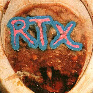
There’s also a Merzbow record, I think it’s a greatest-hits type of one, where the front and back artwork are of men missing a good chunk of their faces. Eeeagh. Luckily for me, in this case, I’ve never been able to get into Merzbow beyond merely respect for what he does, rather than actual ENJOYMENT of what he does, so that doesn’t quite count. But seriously, the dude released a 100-CD box set. That’s pretty amazing. ANYONE who can do that gets lots of credit in my book.
Matt Keeley, Seattle WA
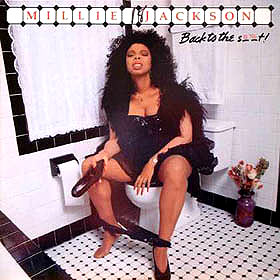
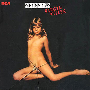
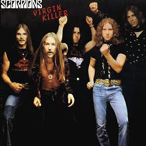
I’ve never understood the idea of “bad” album covers, which are almost always “awesome.” Millie Jackson’s Back To The Shit? Awesome. Every Manowar cover ever? Awesome, awesome. Scorpions’ Virgin Killer? Are you fucking kidding me? Triple awesome—both of them. But people, I’m not just here to gloat about my higher nature. I need to warn you against album-cover judgment. Heed this cautionary tale.
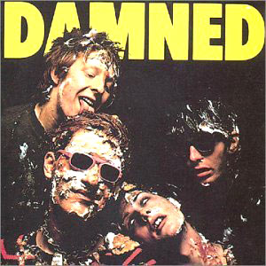
In the mid-80s, I was a teenage punk rocker. Now, this was in that glorious lost time before blogs, so if you needed to know about good music, you had to ask me personally. This pleasant, square young gentleman from a band approached me saying he wanted to buy a “punk” record, and wanted to know what I recommended. Naturally, I suggested The Damned’s Damned Damned Damned, which at the time was the greatest album in the universe. (Still might be. That and D-D-Don’t Don’t Stop the Beat.)
The next time I saw him, he was thrilled to tell me that he had been to the record store and had held Damned Damned Damned is his hands, but when he saw that cover—four guys with pie smeared all over them, one licking it off another’s hair (this he pantomimed for me)—he couldn’t bring himself to purchase it.
“So I bought The Dead Milkmen instead!”
The very next day, he died.
Not really—but whatever happened to him, I’m sure he’s really boring and listens to terrible music.
Kevin Vegetables, Hello Vegetables blog, San Francisco CA
RELATED LINKS:
Great Album, Bad Art: The Cars, Candy-O, Popshifter July/August 2009 issue
2 Responses to “A Woofer In Tweeter’s Clothing: Mismatched Album Art”
July 31st, 2009 at 10:48 am
“What sort of name is Fripp anyways?” “Well it’s Robert Fripp’s name.”
HAHAHAHA!
November 23rd, 2009 at 2:00 pm
[…] A Woofer In Tweeter’s Clothing: Mismatched Album Art, Popshifter July/August 2009 issue […]
Time limit is exhausted. Please reload the CAPTCHA.