The Sepia Tint of Doom: Worst Ideas for Rock Photography
Published on March 30th, 2009 in: Issues, Music, Top Five Lists, Video |2. The deep-thinking, pretentious smoker
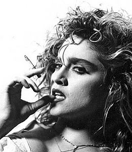
A cigarette will instantly lend some intellectual gravitas to any rock star, despite how bad/insane/drug-addled the rock star may be. One example of this phenomenon is an early 1980s shot of Madonna, who was doing slutty, mindless dance pop in her “Like a Virgin” phase at the time. But, add a cigarette and a vaguely sulky look, and she instantly seems like an intellectual genius on par with Jean Paul Sartre himself.

The key to this photograph is not just the cigarette, but the unfocused, “I’m a serious thinker” look, combined with the thumb introspectively touching her lip and the use of black and white film. Without these accouterments, she’d probably only resemble the chick from the “Like a Virgin” video, except with even less-groomed hair and a bad cluster of chin acne.
DISHONORABLE MENTION: Photographers also love to pair musicians/artists with alcoholic beverages, sometimes for advertisements but mostly to get across the fallacy that the musician is extremely cool and suave with their glass of vodka and orange juice. The reality is that most people act morally reprehensible with vodka and orange juice, and can’t stop with just one. At any rate, here’s Mariah Carey, Jay-Z, and Diddy, all attempting to convince you of their immense wealth and alcoholic travails in a screen shot from the video for the Jay-Zsong “Roc Boys (And the Winner Is). . . “
1. The impenetrable moodiness of the sepia tint

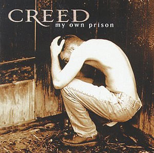
The father of using sepia tint in rock photography is Anton Corbijn, who is an innovative photographer and video director. However, when imitators got hold of Mr. Corbijn’s sepia-tinting technique around the mid-1990s, things began to get dreadfully self-important. Case in point: the cover for Creed’s album entitled My Own Prison (Oooooh how deep, you know there will be relevant psychodrama within the music and lyrics of this album. . . or maybe not). View this atrocity of an album cover for yourself.
The overly serious fonts, the very title of the album, and the bent-down, hopeless look of the cover model (remember, he’s in a prison of his own making), all compete with the unbelievable pretentiousness of the sepia tint. I propose rock photographers come up with an embargo upon using this specific type of tint. Black and white is okay, but the sepia tint. . . is just way too much.
YET ANOTHER DISHONORABLE MENTION: While this has absolutely nothing to do with photography, a popular mistake made by music video directors is to put the band in some exotic, “naturalistic” setting to emphasize the sheer drama of the song. R&B group Jodeci’s “Cry For You” video starts with one of the band members playing a piano in the freakin’ desert. Somehow the inherent ridiculousness of this video’s location goes with the bombast of the song (which ends with “BABY I’M BEGGIN’ BABY I’M BEGGIN’ BEGGIN’ BEGGIN'”).
Pages: 1 2
9 Responses to “The Sepia Tint of Doom: Worst Ideas for Rock Photography”
March 31st, 2009 at 10:50 am
“A cigarette will instantly lend some intellectual gravitas to any rock star, despite how bad/insane/drug-addled the rock star may be.”
hahahahaha! genius!
March 31st, 2009 at 10:57 am
I love this article, too. I’ve read it about five times now and I still crack up.
LLM
March 31st, 2009 at 6:15 pm
Of course there’s the always-douchey (though generally restricted to shitty local bands pretty much anywhere) press-kit photo convention of the band trying to look badass near either/or: A.)Brick Wall, B.) Chain-link Fence, C.) Train Tracks. rockandrollconfidential.com has a huge and hilarious collection of just such photos…
April 1st, 2009 at 3:43 pm
Andrew Felcher was never a team player in Depeche Mode. Infact, did he ever actually play anything? I like the photo of DM up above just because Alan Wilder is in the front.
April 1st, 2009 at 3:46 pm
HAHA, Felcher. I’m sure that wasn’t a typo…You’re right. I don’t think Fletch does anything, EVEN THOUGH he was an original band member. Basically he just dances around and looks goofy. Also agreed on Wilder who was always the hottest member of the band.
LLM
April 1st, 2009 at 3:49 pm
The cigarette is so cliche, but some of my faves always have one. However, the only one that actually looks cool with it is Gavin Friday.
One more cliche to add to this entry… are what I like to call either “brickwallers” or “chainlinkers”. The serious band that poses in front of a brick wall or a chained-link fence is so… I dunno…TYPICAL!
April 9th, 2009 at 12:15 pm
I loved all the UK yuppie-angst-soul bands of the early 80s… Heaven 17 is most famous, but Living in a Box was the ne plus ultra of Armani suits, polished oxfords, and skinny ties. And the soul, yes, indeed, the soul.
April 15th, 2009 at 12:33 am
I think SOMETIMES the We Are A Corporation style CAN work — the Tubes did it pretty well with _Completion Backward Principle_ but then, it WAS part of the overall concept of the record, too — the idea of writing songs specifically TO sell hit records (by doing pastiche/parodies of other #1-type hits of the day).
The funny thing is, it WORKED, and Capitol insisted they keep doing that. Unfortunately, diminishing returns, since, well, the joke was gone.
April 22nd, 2009 at 9:05 pm
I can think of so many fine examples of each of your points in my own record collection. This article is amazing.
Time limit is exhausted. Please reload the CAPTCHA.